Logotypes
A confectionary company has asked you to present some ideas for a new range of chocolate bars. They are looking for logotypes and decorative typography that can capture a sense of the unique qualities of each of the bars.
AZTEC GOLD
First, I pulled apart the name and what the words meant to me, I looked up Aztec patterns and they were in keeping with my impressions of stone brick temples and pyramids that came to mind. I looked up ‘fragments’ and found image of the same name by an artist called Brooke Boothe (ref below) that fit perfectly with its angles and bright colours. I also found an image of honeycomb to create a colour palette.
SKETCHBOOK


Then I moved onto working digitally.
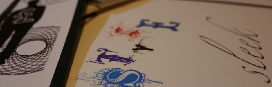
PROGRESS PICTURES (screenshots)


I couldn’t find a typeface as a starting point, so I created the letters out of squares. I Wanted to make a pattern to fill the letters and made a honeycomb with a blend of colours but when I put it into the shapes, it just looked spotty, you couldn’t see the shapes. And the 3D effect just looked like a glitch, so I went back to the idea of fragments. I kept a hex shape as the base, but broke it into pieces and shifted them around. The colours were all picked from the honeycomb image. This worked well and I created a 3D effect by putting a copy of the letter shapes below.


I was keen to keep a ‘stone’ effect in keeping with the idea of temples. I used a vector to overlay like a filter, but it just looked grubby.


FINAL AZTEC GOLD LOGOTYPE
Placed on a stone coloured background with a subtle transparent grunge vector filter.

HIGH TEA BISCUITS
SKETCHBOOK – brainstorm and ideas


RESEARCH
M&S and National Trust biscuit ranges, tea cup image ref below, gold bullion for colour ref.


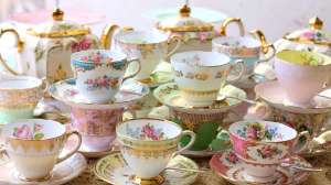

I like the idea of the quaint little tea cups, they’re predominantly white with dainty floral designs and gold leaf detail. It’s the type of thing we had when we went to afternoon tea with my Granny. I also wanted to reference the time of day that high tea is/was taken by fitting a clock into the design.
It was hard to fit the floral detail into the narrow spaces of the letters, so I tried out a floral pattern using elements from Creative Market by Twigs and Twine.
PROGRESS PICTURES – screenshots


I used Nomah Script-Light as a basis for the typeface. I wanted it to be a tall composition to reflect the word ‘high’. I came up with an idea to put the words around a clockface, but was keen to just use letters with added detail, I didn’t feel that using images was true to the brief. This made this particular design quite a challenge for me.


I found that simply adding a pattern didn’t really cut it – It looks like a pattern you’d see on an outdated sofa. It needed to be toned down and to include white.
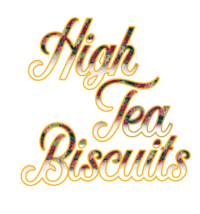
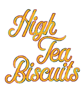
FINAL HIGH TEA BISCUITS LOGOTYPE

POW MILK BAR!
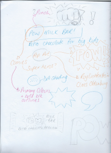
SKETCHBOOK – brainstorms
RESEARCH (references below)


SKETCHBOOK

My image of this was to follow the theme of the comedic ‘fight scenes’ in comic books, I wanted it to be bold and simple, I drew the lettering for ‘POW’ in illustrator
PROGRESS PICTURES – screenshots

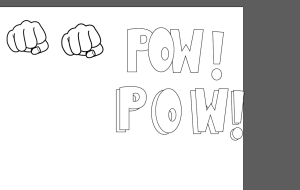


As much as I like the fist as the ‘o’, I also liked the simplicity of the word ‘pow’, I moved the exclamation to the end of the word rather than the sentence, for more impact.
I also wanted the design to look worn, so I included a filter to give the effect.
FINAL POW! MILK BAR LOGOTYPE

REFLECTION
This was quite a fun exercise, I enjoy working with type. The High Tea Biscuit was really challenging and I think it shows. I followed my design process but I’m not keen on the result, I can’t pinpoint what it is about it, maybe the colour of the flowers in the pattern? I’m not sure. Maybe it will become clear if I return to it at a later date. I’m pleased with the pattern for the Aztec Gold bar, I think it captures all elements in a complementary way. And I love the POW! Milk Bar, it was fun to make and fulfils the brief.
REFERENCES
Brooke Boothe, (Unknown), Fragments [ONLINE]. Available at: https://www.decalgirl.com/artwork/5386/fragments [Accessed 12 February 2017]
more-sky.com, (unknown), Honeycomb Wallpaper #24095 [ONLINE]. Available at: http://more-sky.com/WDF-190648.html [Accessed 12 February 2017].
Unknown, (unknown), high-tea [ONLINE]. Available at: https://twofatblokes.com.au/high-tea-spring-special/ [Accessed 13 February 2017].
Roy Lichtenstein, (1963), Whaam! [ONLINE]. Available at: http://www.tate.org.uk/art/images/work/T/T00/T00897_10.jpg [Accessed 16 February 2017].
Roy Lichtenstein, (unknown), Oh my god I’m so retro [ONLINE]. Available at: https://uk.pinterest.com/pin/200691727123868395/ [Accessed 16 February 2017]
Claes Oldenburg, (2010), Mistos [ONLINE]. Available at: https://photobarcelona.wordpress.com/2010/04/07/giants-matches-mistos-sculpture-claes-oldenburg-la-vall-dhebron-barcelona/ [Accessed 16 February 2017].
Unknown, (2017), selection of retro sweets and chocolates from the 1960’s [ONLINE]. Available at: http://www.allsorts4u.co.uk/storepage142486.aspx [Accessed 16 February 2017].
BlueG, (unknown), Retro cartoon comic with humerous shouts reminiscent of the caped crusader [ONLINE]. Available at: http://www.blueg.com/gallery/themes/home/?cat=gaming&name=retro-comic-shout [Accessed 16 February 2017].


